Showing posts with label design. Show all posts

Wednesday, April 16, 2014

Moorcock?*


A brief note to flag up my recent rather niche Pinterest additions. You'll find scans of my dusty old collection of books by (or edited by) Ladbroke Grove's leg end: Michael Moorcock. I collected these books mainly in my late teens when recreational pursuits collided with an insatiable desire to read. There wasn't much on TV in those days.

But MM - never, it has to be said, the world's most nuanced of writers; he did churn them out, my galleries are the merest tip of a really big iceberg) - still managed to win you over with size. Not only with trilogies, quartets and endless series of novels, but also with the sheer size of his imagination. No matter that he was portly, had a big beard and probably invented steampunk (double boo! even if we didn't know it at the time, obviously). To my peer group he was cool. He even had his own pet rock band.

What's more, via the integral part he played in forging a new sci fi aesthetic as edior of influential journal, New Worlds, he was the portal to other, even cooler writers such as J G Ballard, M John Harrison, Roger Zelazny, Brian Aldiss, Thomas M. Disch, or even William Burroughs.


However I found that the tedious business of scanning lots of old books from my late adolescence focussed my mind on the way in which we experienced visual design a few decades ago. Was it design that brought music and literature so much closer together, or were the cultural lines merely so blurred in those far off days that illustrators could find work in more places?

Whatever the answer, the fact is that many of the artists who produced these covers also worked on album sleeves, cinema production design, magazines and more. They provided, in the absence of more than one Stanley Kubrick, the equivalent of today's brain melting CGI for the kids who, y'know, dug it. It also gave our world a kind of coherence. In the same way that Moorcock emulated his own Multiverse by writing a vast swathe of interlocking, intertextual books with recurring characters, the covers of the books connected us to other worlds, dreamed up by other musicians, writers and artists. Obvious, I know, but still true.


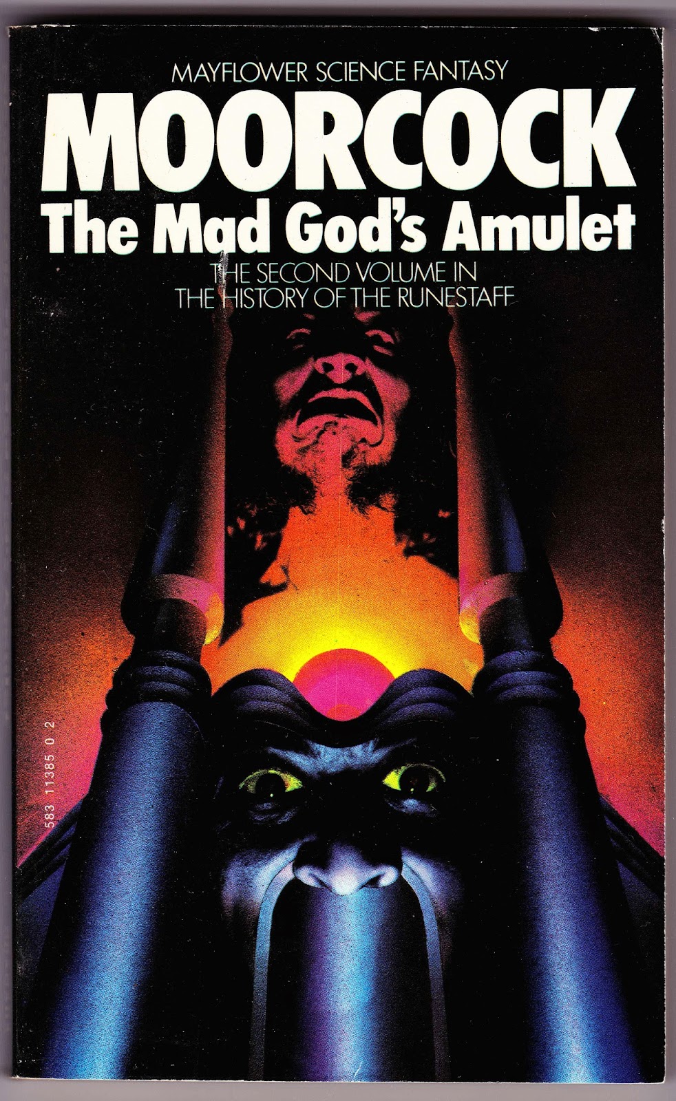
So there are covers by everyone, from Rodney Matthews (boo!), to Chris Foss (yay!), with even some real stinkers thrown in such as Boris Vallejo. The four 1979 Quartet Jerry Cornelius paperbacks are real favourites of mine.


One board is entirely devoted to the work of Bob Haberfield who I know next to nothing about, except that he's Australian and (if still with us) 76 years old. At the time I found his covers brash and clumsy compared to, say, the jewel-like hallucinations of Patrick Woodroffe (above) or the elegance of Bill Sanderson's Jerry Cornelius covers. But putting them together I admire both their vigour and their variety. Does anyone else know any more about this guy?


So, there you go. if you like dodgy '70s sci fi book covers, this may float yer boat...


*sorry, pun stolen from Tony Benyon in about 1904

Friday, April 19, 2013

Storm Thorgerson 1944-2013

Last night it was announced that Storm Thorgerson, one of the founders of the legendary Hipgnosis design studio, had died at the age of 69.

Thorgerson was, like most of the creatives that surrounded the Pink Floyd, a contemporary and peer of the band, attending the same school as Syd Barrett and Roger Waters as well as being a childhood friend of David Gilmour. In fact Hipgnosis (which he founded with Aubrey 'Po' Powell) got their first break by designing the Floyd's second album sleeve: A Saucerful of Secrets.


The plaudits are (rightly) pouring in, although there are certain caveats which probably need to be made clear before we all descend into mass adulation. Thorgerson was probably, above all, a man whose wit and erudition found a channel in the visual puns and sleight of hand which cropped up in his design work, especially the photographic kind. It's wonderfully dated now, but Hipgnosis' work on the repackaging of the Floyd's first two albums in the early '70s as A Nice Pair really sums up the stoner hilarity that permeates their early work, filled, as it is, with a host of punnery, alongside some period sexism.


The early work he and Powell did for the posh proggers was always tip top, and more importantly of a much higher quality than bands had been used to up until that point. using top photographers and graphic artists (especially the criminally underrated George Hardie who actually drew the Dark Side of the Moon cover) meant that their work always stood out, even if it was sometimes wonderfully oblique. My favourite from this period is probably their cover for Atom Heart Mother. can there be a more iconic bovine?


From these early days onwards this was a design studio that, if they could get the concept accepted by the band, would utilise a budget to the max. Take a look at this old fave for The Nice - Elegy. This was shot in the Sahara with actual blow-up beach balls, with the production assistant walking backwards along the crest of the dune so there wouldn't be footprints (allegedly if you look closely you can see where he's fallen over right at the end in the distance).


By all accounts, Thorgerson was a larger than life character who quite obviously had a sense of humour. Another favourite from the late '70s is the cover Hipgnosis did for XTC's second album, Go2. The meta humour perfectly reflects the band's clever-dick approach to 'new wave' and, to this day, still makes me laugh.


He wasn't afraid of controversy either. Can you imagine ANYONE getting away with the sleeve for Led Zeppelin's Houses of the Holy these days?


Yesterday's Guardian obit brought out Douglas Adams' famous quote that Storm was 'the best album designer in the world' (Hipgnosis designed early covers for Adams too), although I fear that the constant deification of Adams along with the unconditional love showered on Hipgnosis and the Floyd by several generations of young people may skew the picture somewhat.

Thorgerson undoubtedly played a pivotal role in the way in which we regard commercial art - not only in his work but also through his publications of collections of other sleeve art - but often (especially in later years) his work tended to lapse into cod-surrealism with somewhat trite plays on words or phrases. As striking as these polished images could be they often lacked the subtlety and obliqueness that kept my generation staring at the cardboard sleeves for HOURS. After Wish You Were Here Thorgerson found a style that he often stuck to far too rigidly.


Also Hipgnosis' work quite often seemed at odds with the music contained within. It took me years to accept that Going For The One by Yes was a good album, simply because I was so disappointed that the band had rejected their own pet designer, Roger Dean. That naked man against clean, totalitarian modernism? Urgh...


But in the end Storm Thorgerson was, and should remain, a legend in terms of record sleeve design. Everyone, from Dean to Vaughan Oliver owes him a debt. And if I were to pick my own absolute favourite of his sleeves, I wouldn't pick DSOTM or even that lovely cow, I'd pick Peter Gabriel's debut album. For years I wanted a car THAT colour. It's enigmatic, slightly creepy and the car also hints at the slight Americanisation that Gabriel got into his music at that point. In other words, it's perfect.


Thursday, December 13, 2012

Peckham Postcards

(click to enlarge)

An early Xmas present to myself thanks to serendipity and the immense generosity of Loraine Rutt - ceramicist of this parish and a gifted craftsperson. Loraine (whose own site with many pictures of her work can be found here) - specialises in... well, let me quote her from her own bio:
'My art practice explores movement of sea, of goods, of people, of shoreline, and of satellites; and the work produced sets points in time, points of view, sets places, and sets details. A recurring theme is a particular fascination with mapping transient details by direct casting, such as the movement of material by the sea.'

(click to enlarge)

The works I've luckily come to own are pictured here. They're five porcelain 'postcards' of Peckham; each one detailing the development of the same area and based on maps and surveys dating back over 200 years. Each one comes with its own oak stand (made by Loraine's cabinet-maker husband, Steve) and is designed (as you can see) to be backlit. I love the way they glow and allow the cartographic details to shine out.

(click to enlarge)

As an ex-cartographer, I'm instantly drawn to work like this (and Loraine also uses maps of the moon in some of her work - making it even more alluring to a space fan like myself) - not only does the medium of clay give a satisfying tactility to the beauty of mapping, but it also introduces formality into our relationship with what is in essence something utilitarian.


(click to enlarge)

Coincidentally, Loraine's work also mirrors another of Peckham's artistically fertile population - the estimable Tom Phillips, whose own work often uses maps of this very same area as a basis for his prints and paintings. There must be something in the water...

Anyway, if you like this stuff, there's tons more on Loraine's site, as well as in her studio which is in Arch 191, Blenheim Court, 48-50 Blenheim Grove, London SE15 4QL.