A little late with this year's comedy DVD round up, I know, but I've been feeling so un-funny that the very thought of trying to complete my by-now-annual analysis of the iconography of seasonal 'comedy' dvd releases has depressed me no end.
If 2013, with its background ambience of economic ruin and alienation via digital media, has taught us anything, it's that we don't really want to even be cheered up any more. The very fact that inspired my first post in this series - the huge amount of posters advertising these DVDs on London's transport system - has been noticeably absent this year. Of the 18 (fucking hell, 18!) DVDs featured here, only the Jimmy Carr, Seann Walsh and Sean Lock ones have had much in the way of a big push in underground stations or on the sides of buses. Londoners, it seems, are in need of something more concrete than the mere gurning of our favourite jesters. Maybe crack is more up our collective streets this yuletide. What's more, the usual dross that makes up a large amount of the potentially chucklesome fare that features here is noticeably absent this year; i.e: not only do we not want to laugh, we want only the finest comedy available if we're going to be made to snigger at all. So no John Bishop, Jethro, Jason Manford, Peter Kay or Roy 'Chubby' Brown. Be thankful for small mercies...
Anyhoo - I've done my best to collect the awful things into some sub-categories in a vague attempt to give them more meaning than just bits of plastic which will rapidly find their way onto online re-selling forums by the middle of January (more on this later, as well).
And off we go!
I'm a comic, so let's make me look like a COMIC (see what I did there? etc.)
Both Ross Noble and Reginald D. Hunter have decided to put their careers (and DVD sales) in the not-so capable hands of some illustrators by depicting themselves in erm... graphic form. Both of these chaps tickle my funny bone (oh god, did I just type that?) but this strikes me as the modern day equivalent of those awful 60s/70s film posters where amusing stars of the day are depicted having tiny little bodies and massive heads. Usually it was Reg Varney.
Noble wins if only by dint of the fact that Hunter's cover is just plain ugly and looks nothing like him, and because his slightly geeky humour suits the comic book approach used. Too much purple, though. And I dislike the feeble attempt to place him in the 'steampunk' genre by use of brass accoutrements. It says: 'for people with long hair and full-length leather coats.'
It's also worth noting that Noble's title: 'Mindblender' has the space cadet subtext previously used by Bill Bailey (see below) denoting humour that will gain weight after several jazz ciggies. How subversive...


Why the fuck did we bother to even hire a design team?
Jimmy Carr's DVD must have the least adventurous cover AND title of the year. This has possibly more to do with his resurgence after a little bit of tax-avoidance shaming. It looks as if he's trying to be as non-confrontational as possible which is odd, considering the fact that his humour is all about coming very close to the knuckle. But 'Laughing and Joking'?!? What the fuck did he think we expected him to do? Show us how to cook Xmas dinner for 12 while bombed on gak? Give us a history of Britain's waterways?? Poor.
Micky Flanagan (not a favourite of mine) gives us the sideways glance, which I guess implies a 'sideways glance' at life, eh? It also uses the sub-genre of looking UP. I think the oft repeated motif (along with its cousin, glancing up mischieviously under eyebrows) denotes a cheeky 'we're all in this together at the bottom of the shitheap and yet I can still crack wise and find life amusing.' Of course it has the reverse effect on a curmudgeon such as myself. I want to slap him. The cover may have taken about half an hour to design.
Adam Hills wore a suit and then someone in the art department photoshopped the 'shadow ears' joke in behind him. How non-threatening can you get? The cover claims him to be awe-inspiring and effortless. These are not qualities you require from comedy. You want preconception-busting and edgy.
In this batch we can also view the other much-used trope of delivering the title of the DVD in 'jokey' hand-written script, denoting a laissez-faire approach to life. One day I'd like to see a comedy DVD with the title and name in Baskerville, which is the world's most serious font (I googled it just now).


Who? Naughty little me?
This particular sub-set of the comedy DVD was referred to last year as 'I've done something a bit naughty', and it looks set to run and run. Alan Davies (a man who is surely old enough to know better by now) and Josh Widdicombe (you KNOW he's younger because nobody over the age of 35 is called Josh these days) have both been a bit, you know, irreverent or something. Damn their eyes.
Davies' use of a zipped-up cardigan almost pushes him into the next category, but that eternally puppy dog expression of his (albeit with a slightly ageing cynicism) means that even as a pensioner he'll be playing the eternal teenager who pissed in your metaphorical pool. Widdicome sits cross-legged, denoting an equally cosy approach. There's the handwritten title as well! His talent is allegedly 'priceless.' which should make it easy to get hold of this post-Xmas, eh?


Bemused of Tunbridge Wells
Both Jack Dee and Greg Davies are very funny men. Their schtick often requires the bemused demeanour of the middle-aged man, tired of life and all the bullshit that goes with it. Davies combines (again) the handwritten approach with the frankly surreal, and doesn't even bother to LOOK at the buyer. Top marks for this, no matter what the contents are.
Jack Dee looks idiotic, but the design department's use of a Victorian handbill font and reasonably tasteful colours make it one of this year's other more acceptable purchases.


Mr Malapropism
Props: more and more these become required by the modern stand-up to really ram home his or her craziness/lack of respect for convention/breaking away from the standard mores of modern gag-telling. Often they convey the extra de rigeur touch of acid-tinged weirdness needed for today's skunk-befuddled masses. Whatevs. The use of objects, gizmos and the like to brighten up your last-minute present ideas (let's face it, no one actually ASKED for that, you just saw it on your way out of HMV and thought 'that would be good for X, he/she has a sense of humour...') is well to the fore in this year's crop. To demonstrate...
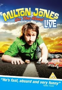
I like Milton Jones, always have. I fear that his pun-heavy routines may have jumped the shark (or have just reached their natural saturation point), but to a man with a childish sense of humour such as myself, his work is amusing. What is not amusing is the way in which the phrase 'On the Road has been literalised to the point of stupidity. Milton is funnier than this, but you'd hardly know from the picture of him with some toy cars.
Andy Parsons specialises in politico-social observation, albeit the kind that's more palatable than the ranting of Mark Thomas. Here he is, leaving Cameron's 'big society in tatters' by sitting in a deckchair in order to depict his more relaxed attitude to subversion. A 'slacktivist', indeed. Again the handwritten title. The design team must have dragged him down to Homebase for this one.
Seann Walsh (note the crazy double 'n') has employed a trick from last year's batch - the overhead wide-ange lens approach to give the picture a more 'in yer face' feel. Oh, and a tail, because, well... he's wild. Can't you bloody read?
Eddie Izzard harks back to the '60s with an umbrella (gasp!) and some swirly Maurice Binder-style graphics. Unfortunately it reminds us all that he was in 1998's disastrous Avengers movie (you remember: with Uma Thurman and Ralph Fiennes). It's probably just as brilliant as every other piece of stand-up he does, and the title hints at his legendary multi-lingual approach. But it'll still be on eBay by February.
Finally, Bill Bailey's actual use of props on stage (well, musical instruments could possibly be counted as props, couldn't they?) make his heavily photoshopped piece of absurdity more acceptable. Like Ross Noble before him, the title appeals to the quirky and herbally refreshed among us. God bless him, say I.


The 'damned if I know' category
Told you I was feeling unfunny. Basically, these two DVDs fail to do any kind of conforming and to denote anything other than a vague indifference for the buyer hungry for LAFFS.
Mr Lock is, again, a favourite of this parish, yet his use of Austin Powers-style faux psychedelic lettering to reinforce the title goes against the other signifier, which is that of Sean giving his best indignant 'WTF?' pose. He's good at this style of stand-up. His design department have obviously never been to one of his gigs.
Tom Stade is Canadian and pretty good. He's gone for a combination of the wide angle approach with a vague hint of fake neon (AND a real microphone) to show you that he is, indeed, a stand-up comedian. One can only applaud such lack of pretension, if not his hair, which manages a stand-up act all of its own.
B'boom tish...


And finally...
You peaked a little early
You may not believe this, but I do at least five or ten minutes of research when writing this drivel. And in my attempts to capture most of this year's comedic moments on small silver and plastic objects I discovered a woeful fact.
Most of the above were released on ONE day this year - November 18th to be precise. This coordinated release date has obviously been calculated to give enough return on something that, frankly, has a shelf life slightly longer than those strawberries from outer Mongolia you bought by mistake in Waitrose last week. And proof of this limited shelf life comes in the form of our last two entries below.
Both Henning Wehn and Nina Conti's marketing teams thought that maybe, just maybe, an OCTOBER release date could net them slightly more for their (admittedly) more marginal fare. Don't get me wrong, I'm very fond of both of them. Wehn's usually turning up on Radio 4 quiz shows hosted by David Mitchell, being all German (although I'm confused by the description of him on his cover as 'a vulnerable man'), while Conti's post-modern (read: foul-mouthed) ventriloquism is great and was brilliantly highlighted in the underrated Christopher Guest sitcom, Family Tree.
But that early release did them NO favours at all. I found that both had already made their way onto eBay. What a shame.
Or maybe it was, as usual the lame covers which did them no favours. Anyway, if any of you actually GET any of these for Xmas, my condolences. See you next year, by which time the crop will have been reduced to a single two-hour film of Freddie Starr on stage screaming at himself in a mirror.
Keep smiling!


No comments:
Post a Comment